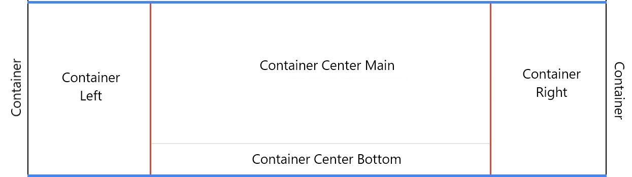
As shown in User Interface, Panels Layout has different sections in the UI. But internally there are no fixed containers. Instead it is driven by a tree datastructure (see Data structure) and placement tags are used to handle the positioning of Panels. Following are the placement tags used by the framework.
| Placement | Placement Key | Behaviour |
|---|---|---|
| Root | root |
Outer container that wraps the whole Workspace |
| Container | container |
Inner container that wraps all Panels and Panel Groups |
| Container Left | container:left |
Left Sidepanels |
| Container Left Inner | container:left:inner |
Inside Left Panel Strip |
| Container Center | container:center |
Container that wraps Main Area and Bottom Sidepanels |
| Container Center Main | container:center:main |
Main Area |
| Container Center Bottom | container:center:bottom |
Bottom Sidepanels |
| Container Center Bottom Inner | container:center:bottom:inner |
Inside Bottom Panel Strip |
| Container Right | container:right |
Right Sidepanels |
| Container Right Inner | container:right:inner |
Inside Right Panel Strip |
These areas are positioned as shown below
 ⠀
⠀
⠀
⠀
⠀
⠀
Components
As described in User Interface, User Interface has Panel, Panel Groups and Panel Strips. But internally it is handled with the following components
Panel
Panel is the feature/functionality component. So internally it is handled the same way. It is defined here : Panel
FlexPane - Panel Groups and Panel Strips
FlexPane is the container component which is used to display a Panel as Single Panel, Panel Group and Panel Strips.
- FlexPane renders Panel Group. It makes used of a tabbed UI to handle multiple Panels.
- Single Panel is a Panel Group with only one member
- Panel Strip is FlexPane with its type property set to
group. In this mode it can render other FlexPane instances as child elements which will result in a Panel Strip
More details here: View and Panels ⠀ ⠀ ⠀